
Adobe Express
Tasks play a major role on home as an entry point for users to be directed to the Express editor with an intent based interest. A task’s intent is to direct a user to a “start from scratch” blank art board with the expected task size.
Task Iconography
Tasks play a major role on home as an entry point for users to be directed to the Express editor with an intent based interest. A task’s intent is to direct a user to a “start from scratch” blank art board with the expected task size.
From user testing, results found that users misinterpreted the previous task row—A user’s expectation was that clicking a task would bring them into the Express editor to remix the featured template. A task’s actual intent is to direct a user to a “start from scratch” blank art board.
My role was to create a visual design system that was cohesive to Express home’s rebranded visual language whilst also making the task intent clear.
My role was to create a visual design system that was cohesive to Express home’s rebranded visual language whilst also making the task intent clear.


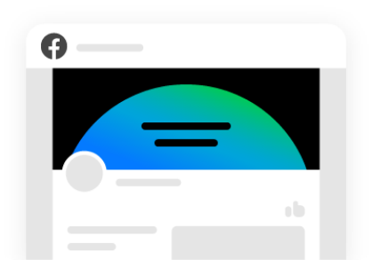


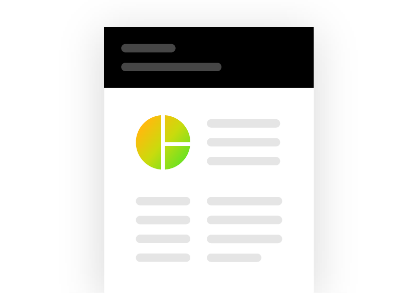
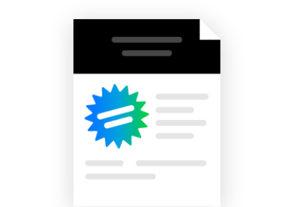
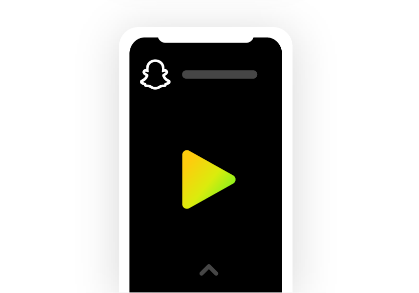

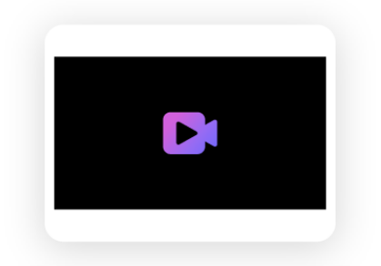

I streamlined task visualizations to be a scalable design system cohesive to the Express branding. The color, iconography, and illustration style is built to be adaptable to the multitude of task types ranging from a social media mobile video to a printed T-shirt or mug.

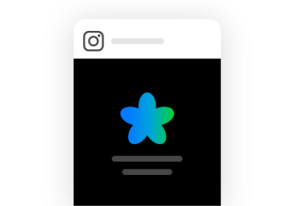

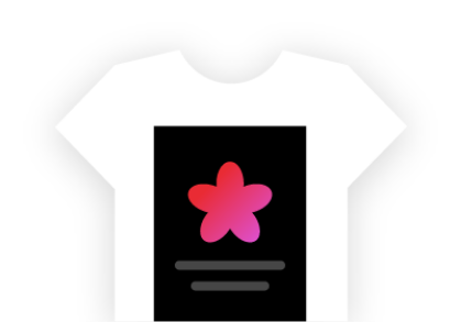


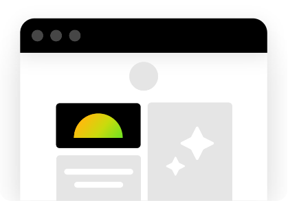
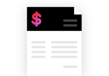

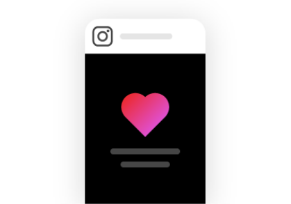
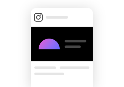

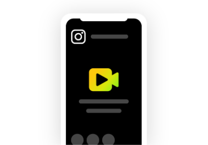

The color palette takes inspiration from the Adobe Express logo—a cropping of the Express gradient applied to key iconography within a featured zone of black. This application ties brand consistency while maintaining visual balance knowing that multiple tasks would be featured together.
Task Illustrations
Role: Creative Direction, Brand Identity
I partnered with Kath Nash to create the guidelines. We worked with Halftone Agency to scale the design system to over 150 tasks.
Role: Creative Direction, Brand Identity
I partnered with Kath Nash to create the guidelines. We worked with Halftone Agency to scale the design system to over 150 tasks.