FlyQuest
Working with Tricia Sugita and Michael Choi, I was approached to rebrand the FlyQuest logo into a mark that encapsulated their mission of environmental initiatives, the dynamic nature of esports, and their inclusive and wholesome community.


“I wanted something that was more rounded and soft,” Sugita says. “It feels welcoming, inviting, wholesome, all of those things it brings you. The old logo did have boldness that I appreciated, but it was just too sharp and edgy. If you get those shapes right, it becomes inclusive, and that’s
really what I’m trying to go for.” The Verge

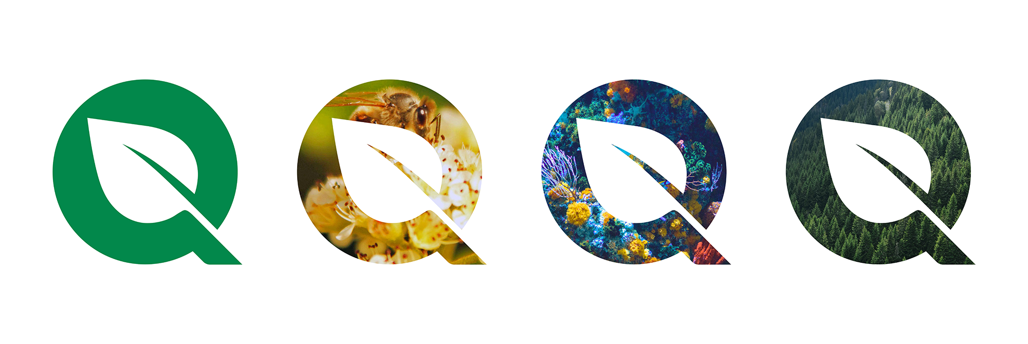
The leaf drawn within the negative space of the ‘Q’ in Quest paired with an emerald green symbolizes the organization’s many environmental campaigns. From BeeQuest, SeaQuest and TreeQuest, the leaf encapsulates all of FlyQuest’s past and future Go Green initiatives.

FlyQuest Rebrand Announcement Video
FlyQuest
Role: Brand Identity, Logo Design
• Featured on The Verge
• FlyQuest’s Twitter Announcement
Role: Brand Identity, Logo Design
• Featured on The Verge
• FlyQuest’s Twitter Announcement